
I recently had the chance to make a very special poster to
honor a special event.
THE EVENT AND ITS SETTING
ZamBamBooGee was going to play a gig at the Kraken. And this
warranted a poster.

THE KRAKEN
For those not yet familiar, the Kraken, located at Dobson’s
Crossroads, out on fabled Hwy 54, was for many years a biker bar. It has a
rough hewn look to it, that makes it somewhat reminiscent of a Western saloon,
say somewhere in the high Rockies. And with a cozy honky tonk feel, it is
perhaps truest to the name roadhouse we have in these parts, these days.
Maybe for this reason, over the years, and maybe even more
so in recent years, it has become a favorite place to play for area musicians.
It came highly recommended to Scotty Young, our percussionist, guitarist, and
harmonica player, who promptly lined up a gig over there.
While I had passed the place many times a few years ago, on
way to bassist Jody McCall’s own music shack, when I was playing drums with him
and Steve, and Rhonda Robichaux, I never did stop in.
But with our gig lined up for March 16th,, the
prospect of realizing my dream of playing behind a chain link fence seemed
finally within reach…
INFLUENCES FOR POSTER
So this was exciting enough for me and the band, and the
name the Kraken already had taken ahold, and had my imagination pretty well
stirring..
Tentacles, oozing in and out of the view finder, curling
through holes in rough wood, and lots and lots of beer.
Not to mention, that ZBBG keyboardist Sue Saunders and
bassist Bruce Saunders, both hail from the Buzzard’s Bay/Hyannis area. Sue,
bless her heart, will occaisionally cook for us to sustain us during practice,
and often comes up with some steamy pot of seafood, say muscles (a plate of
which is featured on a previous ZBBG poster!)
So, in desiging the poster, it seemed only appropriate to
build on the legend of the Kraken, and my merritime band-mates’ proud origins,
by incorporating some of this nautical imagery into the poster.
So I began to concoct something in black, sketching out my
ideas on black paper in white conte crayon…
BASIC PLAN
My plan was a pretty simple poster, 8.5” x 11”, drawn on the
horizontal, a clear departure in every way from my ZBBG’s previous posters
vertical, 11” x 17”. I’m not sure why, I guess I just felt like this event
demanded its own particular feel.
Guess I was thinking straight forward rock poster, with the
tentacle being the main feature. Eventally a horizon/ship suggested itself.
I had a thought to incorporate some of the Kraken bar’s
rough hewn wooden feel in the background also, which (in the end) did come
through a little bit in the sky, which has a scratched, wood grainy kind of
texture. However this is mostly coincidence.
FEEL
For the overall feel/tradition that I really wanted to cop
was that of scrimshaw, which of course
is the craft of sea faring sailors, whiling away the hours, by carving into
whale teeth, and rubbing India ink into the cut crevices, in much the same
manners as the tattoos of the time (perhaps as a gift for their sweety far
away).
Thus I also wanted the border to reflect this tradition,
using a pretty rudimentary motif of
X’s and O’s, as carved by a sailor’s crude pocket
knife. This was the essence of the
feel, and I felt pretty sound about it.
A TWIST IN THE LINE UP
But then fate contributed some interesting additions.
Apparently, local “indierockabilly” legend, Dexter Romweber
called the Kraken, and inquired/offered if he could play the late night set
that evening, an offer which they politely passed on to us. Normally we
probably would have said “F U”, but hey, this was Dexter Romweber, a revered
god of Rockabilly, so we said why not?
So while this was in fact a fortuitous turn of events, to
add Dexter to the bill, this did put a little bit of a twist into things,
because I wasn’t really sure how to incorporate his name into the poster design
I already had. The design I had really necessitated having our name at the top,
to function as part of the water surface. And who was the headliner, and did I
need to consult Dexter?...And how could incorporate Dexter into the larger sea
faring motif?...
PRESSURES ON
While I had gotten a good start on the project well ahead of
time, this little hitch was holding me up a bit, and the show date was starting
to creep up on me.
I also had to locate some scratcher board, not so easy now
that my only source, Studio Supply (RIP) had gone the way of many small,
indipendant businesses in these times. My only resort/hope was the very
Michaels that had probably put them under..
For better or worse, after much searching, they did have it.
INSPIRATION TO ‘BREAK ON THROUGH’
And so one day, with pressure mounting, I left my
landscaping day job early, and went and sat infront of Southern Rail for much
needed beer, and a sit down with this looming, struggling poster concept.
Coincidentally, there was a lot of inspiration to be found there, on the porch
of Southern Rail, which I might have overlooked before, in late night drunken
stipor…. A gorgeous Parisian sign in purple, black and gold. Posters set under
glass of table. Very artful place, really.
And suddenly, turning a long hard look back to my poster, I
realized that I wasn’t doing the poster enough justice, that I needed to up the
ante, and go all out, springing for a whole / completely different format, one
that did ample justice to the ideas that I was working out…
NEW FORMAT
So I sketched out several major revisions on pieces of
notebook paper folded in half on their vertical axis, to give me long, “deep”,
narrow strips.
This tall format served to address a key concept at play in
the poster, perhaps at the core of the Kraken Myth; that the Kraken lurks in,
and emerges from, the inky black DEPTHS of the sea. And the fathoms of this sea
are perhaps proportionally as deep as those of the imagination of a human being
stranded out amid a vastness and power so great and belittling, as to make his
very being quiver!
The more I considered this, the more I comprehended that to
ignore this idea of depth in this inky poster, was not only a missed
opportunity, but heresy!
However, this choice was in many ways risky, because it
meant that I would need to either
a)
shrink the entire thing down to fit this long narrow strip on
the largest piece of scratch board that Micheals could provide (which,
especially considering the task at hand, wasn’t very large at all…), Or..
b)
try to piece together two (or more) pieces, which would have
been tedious to say the least..
In the end, after much back and forth, I opted for A. which
allowed me to see my whole design at once, rather than imagining the two pieces
as one composition.
The disadvantage of this approach, however, which proved to
be a serious detriment to the execution of the design, was that it was very
difficult to squeeze in the many letters of our long name into this narrow
width. This did cost the quality of our name representation somewhat in the
poster, however I was able to mitigate this to some extent, in photoshop, with
some help from Photoshop Guru, and ZBBG Bassist, Bruce Saunders.
And furthermore, our name was to be clearly printed at the
bottom of the poster, as our website address, where you might say it really
mattered.
PROCESS
LAYOUT
First, using a soft leaded pencil, I layed out the
dimensions of the poster on my ‘plank’ of scratcher board (in fact, deviding it
right down the middle, leaving me a “Plan B” on the other, unused, side-
Scratcher Board is a very unforgiving medium).
I also layed out the center lines (which I always do).
I then block in with pencil also the general area of poster,
attempting to leave enough space for the various lines of finer point text,
which was somewhat tricky, as I was still writing these as I went!
I then went in with my exacto knife, lightly slicing and
roughing in the images and lettering.
In laying it out, I generally worked my way down from the
top to the bottom. But once I had everything pretty much in place and suggested
in a light scratching, I was able to go back in, and further develop the
various elements, moving around the piece at will, as different sections
attracted/demanded my attention.
FAVORITE PARTS
SEA LEVEL
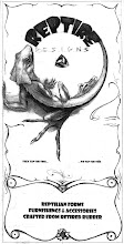
The top portion was a lot of fun.
Originally, I had thought to playfully substitute the
water’s wavy edge for the horizon line. But rather late in the game, just in
the knick of time actually, I decided to add it into the distant background.
Adding in a horizon line, of course helped the spatial
believability of the image a lot (this almost always does). This also helped
establish the sense of surface, which of course was crucial to the idea of
depth, which was key as the eye moves down below..
The Cherub of Wind (or whatever he is), and the billowing
clouds and sail, had all been part of the original design. However, as I
sketched the redesign, and even well as I scratched into the board, these began
to develop. I organized the clouds in a descending line, which helped to
organize the clutter of this image-full section. And I added some ZZ Top
sunglasses and styling to the Cheeky Cherub, a nod to the Kraken’s biker bar
past.
LETTERING
While our ZBBG lettering was decidedly not fun (I had to
sacrifice the necessary space to pull this off as I’d wanted to, for the
vertical format)
The “The Kraken” lettering was a lot of fun.
I have always, since a kid, been a fan of those creepy/hoaky
“Swamp Thing” kinds of letters, which are lit from below, lending a feel of
eminent horror (exactly why I’m not sure). My lust for such lettering was
recently given fresh juice by a marvelous book a friend just gave me of ‘custom
lettering’ from the Sixties and Seventies. This fine tradition certainly worked
its way into this poster as well, as seemed well befitting of Dexter Romweber’s
rockabilly mystique.
TENTACLES
Of course, I also really had fun rendering the various
tentacles, both above and below.
One approach I chose in my treatment of these was to leave
some details of the tentacles lost in shadow, which I think adds to the sense
of lurking danger, and over all, I think, proved to be pretty effective.
And I have to say, think I made a fine addition to (actually
a reduction of), lets just say an adaption of, the Kraken’s logo. Studying
their website, I duelly used their craigy ‘stein’, complete with its ‘K‘
emblem. However, I reduced the writhing full-blown Kraken-in-a-Kup, to a more
subdued and subtle single tentacle, hanging over the edge, like a frothy trail
of beer suds, straight from the cask. This touch of subtlety might or might not
suite the Kraken, but I thought it was a funny take to their logo.
THE DEEP
One of the greatest compliments that I received that evening
was from a source which I happen
to hold in very high esteem. And that is none other than pro Illustrator,
Children’s Book Illustrator and Muralist, Stacye Leanza herself, who came out
to the Kraken both to support us, and undoubtedly, toenjoy some of the action
of the evening. Of course, Stacye and I are both respectively long time fans
and collectors of one another’s poster art.
What she told me was that the area around the harpoon, FELT
like the icy cold depths. This was exactly what I wanted this area to feel
like. So the fact that this come through to her was very interesting!
THE BORDER
In the end, I opted to use more X’s than O’s, not sure why.
I reserved the O’s for next to Dexter’s name, which I had positioned right
smack on the center line, which maybe help draw subtle attention and gravitas
to it.
I also added some teeth the border motif, which was somewhat
inspired by a friend Larry’s mock suggestion to use whales teeth (in an ironic
twist to the scrimshaw tradition). Hopefully, the crudeness of these hashes and
hacks captures some of the spirit of this tradition
CORNER SKULLS
More though, they were drawn from the skulls which I used as
corner pieces, whose gaping mouths held the corners of the image’s body.
This addition was completely spontaneous; I have never used
skulls in this way, nor have I ever seen them used in this way. Somehow though,
the themes of danger and death that pervaded the poster suggested these. And as
my latent high school obsession with drawing schools it seems is not as far
behind me as I thought, I jumped at the chance to render these in carved white
lines on black!
Interestingly, when I finally arrived at the Kraken to set
up my drums for the show, I was tickled to discover that the Kraken is
absolutely LADEN with skull imagery.
They peer out of every nook and crany, looking down from
above the stage, on the interior walls of which hang the ‘Jolly Rogers’ flag of
Black Beard, waving at us staggering across on its grog-spewn deck.
THE GIG

Our gig playing the Kraken was a lot of fun. (I can now see
now why everyone wants to play at the Kraken).

Our crew (of various united crews) were there, Packin’ the
Kraken, and they had a rip-roaring raucus time.
Among the BlueHeron Crew were some Woofers from Pennsylvania
and Saudi Arabia.
Being on the road as they were, it seems to have been a fun
adventure for them (maybe one of our wilder crowds yet..). And they liked us so
much, one girl asked if we were going to come back and play later in the week!
No honey, Bless your heart (as they say around here), I wish we were.
SPECIAL HONORS
Most rewarding, the owner, Eric, asked if he could keep a
copy of the poster, to mount in a showcase he was planning, to show exceptional
poster art for Kraken shows. Of course I would be most honored.

Speaking of honors, I got to present Mr. Romweber himself
with one of the posters.
And to a nice fan of his who had come down from Richmond to
hear him play, I gave a smaller version as a birthday present (which her
husband kindly gave me a handsome bill for).
My home girl Rebecca very sweetly took some footage of us
playing one of our favorite songs, “SuperHard”. (LINK)
SPECIAL THANKS
Thanks to Bruce (and Sue) Saunders for their patience in
helping me get this thing through the digital gate. And thanks to Diane and
Scotty for riding it out from there across the waves of the web.
Thanks to Caviness Printing of Siler City who did a
marvelous job once again, and have upted the ante with their new lines of sustainable
inks and papers.
Thanks to Josh Zaslow for his good feedback and
encouragement with this poster, and to Kavi Rao for allowing me an impomptu
space to work on it.
Thanks to Dexter, for joining us, and sharing his music and
aura with us.
And thanks to The Kraken, for having us, for the beers, and
for the inspiration.


No comments:
Post a Comment