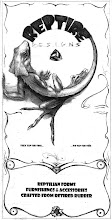
I just finished this illustrative logo graphic, meant for a brochure cover, and maybe a tshirt.
QUICK COMMISSION
I ran into a friend of mine Mary Helen, two days ago at a coffee shop. She was working on a graphic for her daughter-in-law, who is starting a summer camp with the name 'Ever Wonder' (?) (question mark subtly implied!). I liked the concept of the name, and MaryHelen, had made a really good start illustrating this complex concept- had come up with the concept of the illustrative question mark to explore/represent the idea of wonder. She had also already come up with most of of the elements in the design, such as the earth, the musical notation, the rocket, the flag, and the fish. But she was feeling stuck, and was suffering under the pressure of the impending deadline (the next day!)- an experience I am no stranger to. So when I ran into her at the coffee shop on Saturday afternoon, and she showed me her project I offered to take a stab at it. I can't resist a logo design problem. While I was crazy busy at the time, she asked me what it would be worth. Since I needed the money, and she was willing to pay me what I asked, in order to get it done, and off her hands, I agreed to take it, due 2 days later. We talked about some ideas, and 2 days later, this is what I came up with:
Again most of the content and the concept is hers. While I like a lot of content that she brought, my absolute favorite thing that she brought to the design (besides the concept it self), is that fish at the end of the question mark! What an exlamation point, a perfect ending! He seems to be saying, "OK that was fun, but I want to go home now!"
What I brought to the design was:
- a few new elements (the hand/blossom, the jelly fish, the frog, the pipes, the bicyclist, and the book),
- some flow (hopefully- to the question mark)
- the text - lay out and font. (they had it scattered about in the upper portion)
I also introduced an elaboration on the question mark/Ever Wonder concept. By turning the dot of the question mark into a magnifying glass, and also another question mark, who's dot in turn becomes the same, I am attempting to allude to the idea of "ever wonder". I think it is a subtle approach to a subtle concept. You'll have to tell me if you think it is successful.
FUTURE
While all the text they wanted at this point was the name Ever Wonder, I thought that in the future, they/we could place bits of descriptive text below the EVER WONDER, in line with, and in proportion to, the smaller magnifying glasses below.
Also, it would be fun to try this in colored media, maybe watercolor pencils, and also maybe in/on scratcher board. I would love to try painting the question mark in a large single stroke in India Ink on clay board, and then going back in and scratching out the details of those forms. Particularly the Jelly fish, who I think gets a little lost with the pencil, but would come out beautifully in scratcher board.
This was a fun project, and I am quite pleased with how this turned out in the end (considering the narrow time constraint), and I think MaryHelen is as well. I hope that her daughter in law, the owner of the business, will be also.
I hope they will ask me to take another stab it it some day, as I feel like there is much more that could be done with this great idea. (design flows so much easier when you have a rich concept to start with, few people understand this).
I hope they will ask me to take another stab it it some day, as I feel like there is much more that could be done with this great idea. (design flows so much easier when you have a rich concept to start with, few people understand this).
Please let me know what you think! (I have a thick skin when it comes to drawing).
PS follow up- to see how the design came out on their website, and what they did with it, check out this link:
http://www.everwondercamps.com/
Pretty Awesome!!! Got to love it!
PSS Wow, you know it really is a pretty amazing sensation to see some of your work fleshed out in this way, taken to another level, and put to a use far beyond my own scope....wow.
I think this is a new one for me...


