I have been developing a poster for Siler City’s 3rd Friday Concert Series.
This series features a different Musical Performance Group every 3rd Friday of the month (March thru October). It is organized by Joan Underwood, Co-owner of the Courtyard Cafe, and is planned, hand in hand, with the other art, food and cultural festivities, that we regularly hold down here, as part of our on going revitalization efforts in Historic Downtown Siler City. As locals will attest, this regular celebration has gone a long ways into drawing people back off the highway, back into downtown Siler City, to celebrate and use the downtown as a civic space. And the concert series has been an integral part of that celebration.
However, this important Concert Series’ future has been jeapordized by the loss of its Chatham Arts Grassroots Grant funding (which is feeling increased strains as Nation and consequently NC Arts funding dries up, and more local good causes, addressing various heightened needs, clamor to be fed).
Thus to some extent, it seems clear that we must seek other angles and sources of funding, if we are keep the series (and be extension, this entire effort) alive, and rolling. And while I am generally shrewd about my time and involvent, this was writing on the wall that I just can’t ignore. (as a local business owner, a musician, a ‘dancer’, and a romancer, its impossible to watch a good thing just shrivel up and die).
So over the years, I have tried to help Joan find regional talent (Emily Stewart and The Baby Teeth was one great find/score!) I am also trying to help develop a contract for the music series, drawing on my experience as a musician, and contracting graphic design.
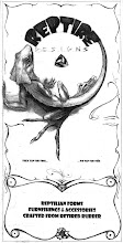
THE POSTER
So my intention with the poster, was, in essence, to brand, (or rebrand) the music series itself, as its own distinctive entity, somewhat independent from all of the other good activities which surroiund the 3rd Friday Event. It seems that the series is really reaching a point of maturity, where is can act as its own individual draw to downtown Siler City, every 3rd Friday night.
Therefor I wanted a consistant format, color scheme etc, that would identify each of the 8 different concerts each year as part of a whole, a series.
To achieve this, I designed a poster with a header, a footer, and borders, leaving the space at the center blank, to feature that month’s Musical Performer- their name, image, and perhaps a brief description.
Once I had that concept in place, (one random evening, when I should have doing something else) , the gears started churning, pumping that creative juice through my masticating brain, like brain slobber…
I chewed it from this angle, gnawed it from that, growled, whimpered, whined, until finally, what came out was:
DOWNTOWN SOUNDS OF SILER CITY
I knew (from my discussions with Courtyard Café Owner Joan Underwood) that the clear, directness of the, (perhaps somewhat informal) previous title, was important to Joan. It worked- it told people What, When and Where. Hard to beat that really. However, I just felt like it needed a little more pizzaz. As they, to “sell the sizzle, not the steak”. And thus, I sought a comprimise, to retain the 3rd Friday Concert Series, as the ‘sub descriptor’, rather than as the ‘banner’.
For the feel, I wanted to capture something of the essense of Downtown Siler City, with all of its brownstone grandeur. According to Arts Incubator Director (and well traveled Architect) Ann Bass, who has the eye for things, Siler City possesses some notable brickwork and buildings, and this is one of the many facets that makes this downtown special.
So I began with a background that was imbued with that rich, irony reddish, purplish orange, that the canyon walls of Downtown Siler City are laden with.
I added to this a light gradient, to try to capture some of the mystery and excitement that I, and others feel in Downtown Siler City.
Next, I wanted some colors that would compliment those clayey earth tones, and for this I chose first a deep magenta-y purple. I am still narrowing in on this exact color, and also the forms which will wear it. But eventually, I hope to have some proud treble cleff, and staffs, glowering with cool intensity in the back ground of all all that brick.
Also to compliment these brick tones, and draw on some of the old fashioned air that the Branding Firm Arnette Muldrom picked up on in their branding of Siler City,
I chose a pallet of cool teal blues, edged with warm, buttery yellows.
I’m not sure why, but this colors draw me back to fond, if imagined, bygone era.
In the footer, I tried to open up the color pallet even more, and dig into some of the flavor that can be found around town on a 3rd Friday night.
One of the most crucial, practical elements of the design, is the space left for a sponsor.
Hopefully, this poster (a whopping 11”x17”) will be one that businesses in Siler City will feel so proud to be emblazoned on, that they will be willing to donate the costs to pay a descent and hardworking band who has traveled far to Siler City, to help us celebrate our Historic Downtown Civic Space!

No comments:
Post a Comment